|
|
Post by Claire on Dec 3, 2008 21:35:04 GMT 1
Hi all, this was suggested by Konstanze. What are your all time fav covers and dustjackets and which ones do you loathe? Lists and also pics please if you know how to work photobucket. If you dont I'll try to find a pic for you and put it on.
I will have to have a think about mine...
|
|
|
|
Post by cally on Dec 4, 2008 0:28:36 GMT 1
That copy of 'If wishes were horses' I sent you Claire is right up there. The Dragon Books cover of 'The 2nd mount' is hideous' with David looking like something out of a Hammer horror film but the cheesiest is the Collins Pony library cover of 'Horses at Home'- YECCHH! That rosy cheeked munchkin looks like an escapee from some sacharin laced American greeting card factory. One of the best covers ironically is on one of the WORST books- 'Ponies Plot': I bought it and only retained it for the cute illustration on the front! EDIT by Claire: can't find pics of the other 2 but have got one of the 'cheesy' Horses at Home - I certainly agree with you on that one!  |
|
|
|
Post by Claire on Dec 4, 2008 22:15:16 GMT 1
So many nice ones it's hard to choose. In the meantime here is my chamber of horrors:  If Ken had seen this monstrosity running wild he would have left it there!  I have a clown phobia and this does nothing to help it! The poor pony certainly did need rescuing!  Some people like this cover but to me its just plain scary!  Sorry but this horse is just plain ugly!  This one looks like it has been stuffed!  My friend and I used to joke this was like the junior branch of the klu kux klan - not very politically correct!  Decapitated pony!!! Ughh!!!   This one looks like it was painted by a six year old 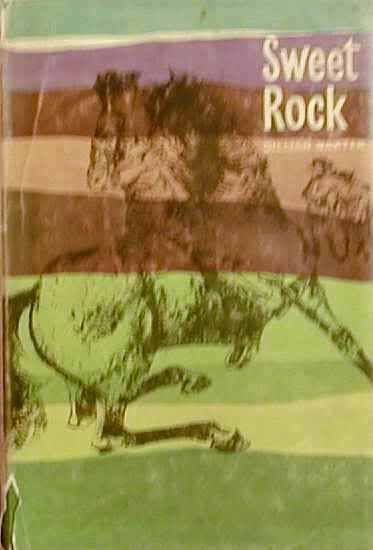 The drawing is actually quite good but its lost amongst those hideous green and purple lines. Why? Were they trying to be clever and portray a candy rock's stripes. And if so why the awful colours? Has anyone got any worse ones than these horrors? |
|
|
|
Post by Buster on Dec 4, 2008 22:54:44 GMT 1
Well I dont have a picture, but one of the Riders on the March is looking quite scary! Its got a red background and James is actually terrifying! Not sure if you know the one I mean..
You actually had me laughing at the Klu Klux Klan one! Ah funny stuff...
|
|
|
|
Post by Claire on Dec 4, 2008 23:47:55 GMT 1
Is that the one where they are holding placards and banners saying save the riding school or something like that? If so I have a pic of it somewhere.
|
|
|
|
Post by susanb on Dec 5, 2008 15:57:24 GMT 1
Claire you already tagged one of my top 2 for worst dj....that edition of Horses in the Glen! I've got one more to add as well as candidates for best dj....will have to get busy with photobucket this weekend!
|
|
|
|
Post by kunuma on Dec 5, 2008 20:20:38 GMT 1
OMG that Thunderhead one, at first I just saw the head, and thought now why is that so bad, then I scrolled down.......................how on earth could anyone have been happy at drawing that!!  However it reminded me of one of my favourite paperback covers, mine is drawn on  but I bet Claire or someone has a photo of it )-it is the one for "Snow Cloud, Stallion." EDIT BY CLAIRE PIC ADDED Edited to say that my "They Rescued a Pony" - same publishers, has a much better cover picture of Punch in the windmill - was that a later edition? |
|
|
|
Post by cally on Dec 6, 2008 23:27:57 GMT 1
SOMEONE WITH PHOTOBUCKET OR WHATEVER IT'S CALLED PLEEASE PUT SOME NICE ONES UP!!! Totally agreee re the clown on rescued a pony. They freak me out. I will get my books off the shelf and have a proper looksee tomorrow. One to keep ypo going- cp-t's 'The lost pony' by Granada/Dragon with a grey pony on a green ground and a misty yellow light coming through the trees behind- lovely. EDIT BY CLAIRE PIC ADDED: |
|
|
|
Post by susanb on Dec 7, 2008 0:14:46 GMT 1
Heading Cally's plea for some good photos! These are in no particular order, and I've limited myself to one selection per illustrator Bright Spurs by Armine von Tempski, Paul Brown illustrator  Vicki and the Brown Mare, Sam Savitt author and illustrator  Cintra's Challenge by Jane McIlvaine, Manning Dev. Lee illustrator  Smoke Rings by Dorothy Lyons, cover art by Wesley Dennis  Bonnie and the Haunted Farm by Barbara van Tuyl, cover art uncredited  The Young Horse Breakers by Golden Gorse, Anne Bullen illustrator  Gymkhana Trek by Jo Packer, Peter Biegel illustrator  High Honours by Pamela MacGregor-Morris, Lionel Edwards illustrator  Thelwell's Riding Academy, author illustrator Norman Thelwell (ok, maybe it's not the most beautiful, but you were looking for "best" covers, and it fits that bill just fine!)  |
|
|
|
Post by susanb on Dec 7, 2008 0:49:03 GMT 1
And a few more for the "worst" category Summer on Wild Horse Island by Mary Elwyn Patchett, American edition  Doggone Roan by Patsey Gray, illustrated by Paul Frame  |
|
|
|
Post by garej on Dec 7, 2008 10:55:09 GMT 1
Worst one:-  It's a pony story..........where's the ponies?  Something doesnt quite add up about the pose of the pony here  Again, where's the horses, but at least unlike the Three Jays book they are doing something horsey.......  A lot terribly wrong with this picture, wishy washy colour, lack of hat, lack of complete bridle, and those eyes........ |
|
|
|
Post by Claire on Dec 7, 2008 11:48:18 GMT 1
Some great pics guys. Methinks I will be pinching some for the website!  Also its nice to see the American ones as they will probably not be on many other people's lists. Garej I haven't seen that particular edition of I Rode a Winner before but it certainly is a stinker! And that copy of Doggone Roan takes the prize for cheesy its even worse than the Horses at Home one! ;D Still pondering on my best ones its really hard to pick from so many. |
|
|
|
Post by garej on Dec 7, 2008 12:00:13 GMT 1
Garej I haven't seen that particular edition of I Rode a Winner before but it certainly is a stinker! It's an American edition. I only saw it once on ebay, but it was so bad that I had to pinch it for future posterity! |
|
|
|
Post by Claire on Dec 7, 2008 13:48:17 GMT 1
They Rescued a Pony" - same publishers, has a much better cover picture of Punch in the windmill - was that a later edition? Is this the one you mean kunuma?  The awful Blackie orange jackets were on the later editions of the series. Unfortunately they are the ones I have. That one is lovely as are all the first editions from the series. Does anyone know is it by Geoffrey Whittam, looks like him? Going back to the Blackie reprints. They must be a candidate for the worst pony book imprint of all time, followed by J.A.Allen series with the huge horseshoes! Just think of the difference between the lovely first edition of The Ten Pound Pony:  and this vastly inferior offering:  BTW added pics to your posts kunuma and cally  |
|
|
|
Post by Buster on Dec 7, 2008 13:58:04 GMT 1
Yeah Claire I think its that one, Fiona (I think) is behind them on her horse looking pretty violent if I may say so! And they are covered in dirt too.. It scares me :S
|
|
lily
Pony Trekker

Posts: 60
|
Post by lily on Dec 7, 2008 16:55:45 GMT 1
Love the Village of the Damned pony and children on Doggone Roan. And as for I rode a Winner, if that's the winner I'd hate to see what the losers looked like...
|
|
|
|
Post by susanb on Dec 7, 2008 17:05:50 GMT 1
Claire.....I don't know, for creepy, undead horse vibe, I think Horses in the Glen is hard to beat (I Rode a Winner is a runner up, in my opinion). But for pure cheesiness, you're right, you'd have to go a long way to top Doggone Roan. (the horse is bad, but the children are a bit unnerving) The first time I read the book, it was borrowed from the library and had lost it's dj...and it's really an excellent book....as I built my collection, I went after all the Patsey Gray books in dj, and you can imagine my shock when I eagerly opened the package containing that book (there wasn't a pic on the ebay auction)!! Gray has been blessed and cursed with illustrators...she's had the best and the worst.
Actually, as a mini side-poll, that wouldn't be a bad idea....."best match/mismatch": best and worst books with the opposite in cover art...i.e., I really loved I Rode a Winner, as well as Horses in the Glen and Doggone Roan, but they have just the worst cover art. And then there are other books that have just lovely dj art, but the stories are bad, or just boring (Jacqueline Rides for a Fall by Pat Smythe springs to mind).
And the flip side, what great books had the cover art they deserved? The Lionel Edwards edition of The Maltese Cat would be one. Big Jump for Robin by Suzanne Wilding with it's great Sam Savitt wrap-around dj would be another.
|
|
|
|
Post by Claire on Dec 7, 2008 18:17:36 GMT 1
And as for I rode a Winner, if that's the winner I'd hate to see what the losers looked like... LOL love it! More like 'I rode a zombie horse' Susanb didnt we have a thread about the best matched or mis-matched books and covers. Think it was called something like Goldilocks and the 3 bears? Will hunt around and see if I can find it. |
|
|
|
Post by sarah on Dec 7, 2008 18:58:03 GMT 1
|
|
|
|
Post by susanb on Dec 7, 2008 19:01:43 GMT 1
Sarah...I do love the look of Bred in the Bone...I love Peter Biegel's work! (They're all good pics, actually, I just love that first one particularly)
Claire....I must have missed that thread entirely!
|
|
|
|
Post by Claire on Dec 7, 2008 20:06:06 GMT 1
|
|
|
|
Post by susanb on Dec 7, 2008 21:24:16 GMT 1
ROFL......my brain is fried, clearly! My posts today have been on short "breaks" from wrapping Christmas presents....it took me three tries to get the last box wrapped, kept cutting the paper too small :-( Totally unlike me, this is the earliest I've ever burnt out.
Sigh...onto the laundry now.......
|
|
|
|
Post by cally on Dec 7, 2008 21:42:13 GMT 1
Thanks Claire. I am very envious of your covers, susanb- especially 'Bright Spurs' and 'The Young Horsebreakers'...and 'The Brown Mare'! And anything with Thelwell is beautiful. I'll have to have another good look at them after the last lot of bad covers- especially 'Doggone Roan'- to wipe the memory away otherwise I'll have nightmares tonight.
|
|
|
|
Post by Claire on Dec 7, 2008 22:07:06 GMT 1
Poor you susan. Never mind only another 17 days to go and it will all be over!  Cally I think I will be having nightmares too what with zombie horses and stepford riders abounding! But at least the beautiful covers outnumber the hideous ones! Still trying to pick my best ones. I have about 20 to whittle down  |
|
|
|
Post by Claire on Dec 12, 2008 13:48:47 GMT 1
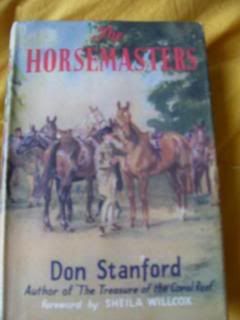
Hello all. Finally managed to pick some of my best covers.   OK not a horse or pony in sight and the book hasnt much about them in either but this is a gorgeous cover. I just love Geoffrey Whittam.  My possible fav of all time.  Some lovely jackets from the series but this is the only one I can find on my computer.  Locely jacket - book isnt so good!  I love the humour in this cover. Really sums up the tone of the story  Compare this to that hideous Thunderhead one I posted earlier!  Victor Ambrus - another one of my fav illustrators.  Lots of lovely jackets in the Jill series. But I like this one best for the expression on the pony's face!  Geoffrey Whittam again. Love his horses, he gives them real chracter.  Gorgeous! Better than the first edition.   Just to prove that there are one or two nice covers on modern pony books amongst the constant stream of glitter, fairies and glam teenage girls which abound nowadays! |
|
|
|
Post by fizz on Dec 12, 2008 21:09:23 GMT 1
Though not a pony book, has anyone seen the truly awful poster the Guardian did on horses & ponies? Someone gave me one to put up at work, so the staff office is nicer for tutorials. The horses are all out of proportion & have the most terrible conformation faults, like coffin heads and the Cleveland Bay is a chestnut!
Well, would we expect anything better from the Guardian given it's views on the Olympic dressage?
It's a pity as some of the other posters in the series are very well illustrated.
|
|
|
|
Post by haffyfan on Dec 13, 2008 11:18:36 GMT 1
I will post the pics later ( Jane recently did this topic too so will go back and find my pics) but My favourite ever (although it didn't win) is the 1st edition of Pancho. The illustration is just stunning and so so real.
|
|
|
|
Post by sarah on Dec 14, 2008 18:39:59 GMT 1
|
|
|
|
Post by Claire on Dec 14, 2008 22:30:37 GMT 1
|
|


 but I bet Claire or someone has a photo of it )-it is the one for "Snow Cloud, Stallion."
 Also its nice to see the American ones as they will probably not be on many other people's lists.